

Browse and find FontStructions
Any Category
Any License
- Any License
- Commercial Use
- Downloadable
- Cloneable
- All Rights Reserved
- Creative Commons Attribution Non-commercial No Derivatives
- Creative Commons Attribution Non-commercial Share Alike
- Creative Commons Attribution Non-commercial
- Creative Commons Attribution No Derivatives
- Creative Commons Attribution Share Alike
- Creative Commons Attribution
- FontStruct Non-Commercial License
- FontStruct License
- Creative Commons CC0 Public Domain Dedication
- Open Font License
Sort: Creation Date
Show:
- Staff Picks (4705)
- All (77734)
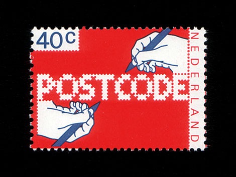
POSTCODE
by nitrada7.55
Click on the stars to rate this FontStruction.
Balanced Rating: 7.55
Average Rating: 7.50
Click for more information about this rating. 26 votes You voted ? for this FontStruction. You may change your vote at any time.
Balanced Rating: 7.55
Average Rating: 7.50
Click for more information about this rating. 26 votes You voted ? for this FontStruction. You may change your vote at any time.

271158713
Published: 6th June, 2008
Last edited: 4th January, 2009
Created: 6th June, 2008
This is still work in progress, a lot of characters missing. There are only UPPERCASE characters available, I filled the lowercase letters with random symbols/patterns. The design is based on this stamp design from 1978 by Gert Dumbar. Use font sizes 64, 128 or 256px. Set leading to 24 (for font size 64), 48 (for 128) and 96 (for 256). More information
Brutto
by Tobias Sommer (shasta)7.65
Click on the stars to rate this FontStruction.
Balanced Rating: 7.65
Average Rating: 7.62
Click for more information about this rating. 26 votes You voted ? for this FontStruction. You may change your vote at any time.
Balanced Rating: 7.65
Average Rating: 7.62
Click for more information about this rating. 26 votes You voted ? for this FontStruction. You may change your vote at any time.
International Morse Code (Stacked)
by SquarePeg7.31
Click on the stars to rate this FontStruction.
Balanced Rating: 7.31
Average Rating: 7.14
Click for more information about this rating. 14 votes You voted ? for this FontStruction. You may change your vote at any time.
Balanced Rating: 7.31
Average Rating: 7.14
Click for more information about this rating. 14 votes You voted ? for this FontStruction. You may change your vote at any time.
15039215
Published: 5th June, 2008
Last edited: 21st April, 2010
Created: 5th June, 2008
The original Morse code was created for Samuel F.B. Morse's electric telegraph in the early 1840s, but spread to radio communications (and beyond) beginning in the 1890s. (It is now known as American Morse code, and rarely used.) International Morse code was created by Friedrich Clemens Gerke in 1848, and standardized at the International Telegraphy congress (Paris) in 1865.
Other current Morse Code FontStructions have encountered word- and letter-spacing issues, and I tried to work around this by stacking the dots and dashes vertically. The result reminds me a bit of Mayan numerals, but hey, as long as it still reads as Morse... I wonder what the ITU would say about this? One thing's for sure... it saves a lot of horizontal space.
In each character, the dots and dashes read from top to bottom rather than from left to right. Punctuation has the longest series of dots and dashes in International Morse Code (six), so this number determined my cap height. :-) The shorter characters all hang from this imaginary line.
Missing characters: Please note that the !, & and $ symbols are not defined within the ITU recommendations for International Morse code, so they are not part of this typeface. On the other hand, the @ symbol was approved for use in 2004, so I've also included the underscore sign I found at two different online sources. (The underscore symbol has not been formally approved by the ITU, but it could come in handy if you have to transmit an e-mail address using Morse code!)
Other characters: As with my two Braille FontStructions, the uppercase and lowercase versions of each character are the same. Also, the opening and closing parentheses share the same symbol, which will also show up if you type brackets instead of parentheses. Last but not least, there are a very few diacritics included (the ones I was able to verify).
Trixel Square Black
by julischka6.57
Click on the stars to rate this FontStruction.
Balanced Rating: 6.57
Average Rating: 5.88
Click for more information about this rating. 8 votes You voted ? for this FontStruction. You may change your vote at any time.
Balanced Rating: 6.57
Average Rating: 5.88
Click for more information about this rating. 8 votes You voted ? for this FontStruction. You may change your vote at any time.
4501101
Published: 5th June, 2008
Last edited: 16th June, 2009
Created: 5th June, 2008
The fat uncle came for a visit. Meet the rest of the Trixel Family here!This is a clone of Trixel Square Fat
Last edited: 16th June, 2009
Created: 5th June, 2008
The fat uncle came for a visit. Meet the rest of the Trixel Family here!This is a clone of Trixel Square Fat
Trixel Square Fat
by julischka6.45
Click on the stars to rate this FontStruction.
Balanced Rating: 6.45
Average Rating: 5.78
Click for more information about this rating. 9 votes You voted ? for this FontStruction. You may change your vote at any time.
Balanced Rating: 6.45
Average Rating: 5.78
Click for more information about this rating. 9 votes You voted ? for this FontStruction. You may change your vote at any time.
3811102
Published: 5th June, 2008
Last edited: 12th October, 2010
Created: 5th June, 2008
A little experiment in legibility. Based on a 3x3 px x. Has some brothers and sisters. Meet them here!This is a clone of Trixel Square
Last edited: 12th October, 2010
Created: 5th June, 2008
A little experiment in legibility. Based on a 3x3 px x. Has some brothers and sisters. Meet them here!This is a clone of Trixel Square
BlocParty Outline
by garphynk6.06
Click on the stars to rate this FontStruction.
Balanced Rating: 6.06
Average Rating: 5.42
Click for more information about this rating. 12 votes You voted ? for this FontStruction. You may change your vote at any time.
Balanced Rating: 6.06
Average Rating: 5.42
Click for more information about this rating. 12 votes You voted ? for this FontStruction. You may change your vote at any time.
Grid Fracture
by tilogo8.12
Click on the stars to rate this FontStruction.
Balanced Rating: 8.12
Average Rating: 8.19
Click for more information about this rating. 16 votes You voted ? for this FontStruction. You may change your vote at any time.
Balanced Rating: 8.12
Average Rating: 8.19
Click for more information about this rating. 16 votes You voted ? for this FontStruction. You may change your vote at any time.
Fretboard
by waylaid6.84
Click on the stars to rate this FontStruction.
Balanced Rating: 6.84
Average Rating: 6.68
Click for more information about this rating. 28 votes You voted ? for this FontStruction. You may change your vote at any time.
Balanced Rating: 6.84
Average Rating: 6.68
Click for more information about this rating. 28 votes You voted ? for this FontStruction. You may change your vote at any time.
zinzan
by intaglio6.46
Click on the stars to rate this FontStruction.
Balanced Rating: 6.46
Average Rating: 6.00
Click for more information about this rating. 13 votes You voted ? for this FontStruction. You may change your vote at any time.
Balanced Rating: 6.46
Average Rating: 6.00
Click for more information about this rating. 13 votes You voted ? for this FontStruction. You may change your vote at any time.
Flim
by Karras6.46
Click on the stars to rate this FontStruction.
Balanced Rating: 6.46
Average Rating: 6.07
Click for more information about this rating. 15 votes You voted ? for this FontStruction. You may change your vote at any time.
Balanced Rating: 6.46
Average Rating: 6.07
Click for more information about this rating. 15 votes You voted ? for this FontStruction. You may change your vote at any time.
Trixel Square Outline Close
by julischka5.86
Click on the stars to rate this FontStruction.
Balanced Rating: 5.86
Average Rating: 5.09
Click for more information about this rating. 11 votes You voted ? for this FontStruction. You may change your vote at any time.
Balanced Rating: 5.86
Average Rating: 5.09
Click for more information about this rating. 11 votes You voted ? for this FontStruction. You may change your vote at any time.
3621102
Published: 4th June, 2008
Last edited: 16th June, 2009
Created: 4th June, 2008
A little experiment in legibility. Based on a 3x3 px x, although rather loosely in this case. Has some brothers and sisters. Meet them here!This is a clone of Trixel Square Outline
Last edited: 16th June, 2009
Created: 4th June, 2008
A little experiment in legibility. Based on a 3x3 px x, although rather loosely in this case. Has some brothers and sisters. Meet them here!This is a clone of Trixel Square Outline
SpaceLab
by gspace6.71
Click on the stars to rate this FontStruction.
Balanced Rating: 6.71
Average Rating: 6.00
Click for more information about this rating. 7 votes You voted ? for this FontStruction. You may change your vote at any time.
Balanced Rating: 6.71
Average Rating: 6.00
Click for more information about this rating. 7 votes You voted ? for this FontStruction. You may change your vote at any time.
Trixel Square Outline
by julischka6.53
Click on the stars to rate this FontStruction.
Balanced Rating: 6.53
Average Rating: 5.71
Click for more information about this rating. 7 votes You voted ? for this FontStruction. You may change your vote at any time.
Balanced Rating: 6.53
Average Rating: 5.71
Click for more information about this rating. 7 votes You voted ? for this FontStruction. You may change your vote at any time.
twenty one
by cliqk6.13
Click on the stars to rate this FontStruction.
Balanced Rating: 6.13
Average Rating: 5.40
Click for more information about this rating. 10 votes You voted ? for this FontStruction. You may change your vote at any time.
Balanced Rating: 6.13
Average Rating: 5.40
Click for more information about this rating. 10 votes You voted ? for this FontStruction. You may change your vote at any time.
Quint City
by nemoorange7.69
Click on the stars to rate this FontStruction.
Balanced Rating: 7.69
Average Rating: 7.57
Click for more information about this rating. 7 votes You voted ? for this FontStruction. You may change your vote at any time.
Balanced Rating: 7.69
Average Rating: 7.57
Click for more information about this rating. 7 votes You voted ? for this FontStruction. You may change your vote at any time.
PolyFace
by dasmuse7.36
Click on the stars to rate this FontStruction.
Balanced Rating: 7.36
Average Rating: 7.11
Click for more information about this rating. 9 votes You voted ? for this FontStruction. You may change your vote at any time.
Balanced Rating: 7.36
Average Rating: 7.11
Click for more information about this rating. 9 votes You voted ? for this FontStruction. You may change your vote at any time.
Wide Horizon
by alexfulton6.48
Click on the stars to rate this FontStruction.
Balanced Rating: 6.48
Average Rating: 5.50
Click for more information about this rating. 6 votes You voted ? for this FontStruction. You may change your vote at any time.
Balanced Rating: 6.48
Average Rating: 5.50
Click for more information about this rating. 6 votes You voted ? for this FontStruction. You may change your vote at any time.
Trixel Square Shadow NW
by julischka6.53
Click on the stars to rate this FontStruction.
Balanced Rating: 6.53
Average Rating: 6.25
Click for more information about this rating. 20 votes You voted ? for this FontStruction. You may change your vote at any time.
Balanced Rating: 6.53
Average Rating: 6.25
Click for more information about this rating. 20 votes You voted ? for this FontStruction. You may change your vote at any time.
squrbed rounded
by woutery6.73
Click on the stars to rate this FontStruction.
Balanced Rating: 6.73
Average Rating: 6.13
Click for more information about this rating. 8 votes You voted ? for this FontStruction. You may change your vote at any time.
Balanced Rating: 6.73
Average Rating: 6.13
Click for more information about this rating. 8 votes You voted ? for this FontStruction. You may change your vote at any time.
dos B
by jaime.md6.64
Click on the stars to rate this FontStruction.
Balanced Rating: 6.64
Average Rating: 5.60
Click for more information about this rating. 5 votes You voted ? for this FontStruction. You may change your vote at any time.
Balanced Rating: 6.64
Average Rating: 5.60
Click for more information about this rating. 5 votes You voted ? for this FontStruction. You may change your vote at any time.
BopCloser
by typerider6.77
Click on the stars to rate this FontStruction.
Balanced Rating: 6.77
Average Rating: 6.30
Click for more information about this rating. 10 votes You voted ? for this FontStruction. You may change your vote at any time.
Balanced Rating: 6.77
Average Rating: 6.30
Click for more information about this rating. 10 votes You voted ? for this FontStruction. You may change your vote at any time.
Great Depression
by Tobias Sommer (shasta)6.99
Click on the stars to rate this FontStruction.
Balanced Rating: 6.99
Average Rating: 6.79
Click for more information about this rating. 19 votes You voted ? for this FontStruction. You may change your vote at any time.
Balanced Rating: 6.99
Average Rating: 6.79
Click for more information about this rating. 19 votes You voted ? for this FontStruction. You may change your vote at any time.
Siam
by Joe Fruchey (joefru)6.44
Click on the stars to rate this FontStruction.
Balanced Rating: 6.44
Average Rating: 6.20
Click for more information about this rating. 25 votes You voted ? for this FontStruction. You may change your vote at any time.
Balanced Rating: 6.44
Average Rating: 6.20
Click for more information about this rating. 25 votes You voted ? for this FontStruction. You may change your vote at any time.
LambChop Series II
by chough6.53
Click on the stars to rate this FontStruction.
Balanced Rating: 6.53
Average Rating: 5.40
Click for more information about this rating. 5 votes You voted ? for this FontStruction. You may change your vote at any time.
Balanced Rating: 6.53
Average Rating: 5.40
Click for more information about this rating. 5 votes You voted ? for this FontStruction. You may change your vote at any time.
Jacobs FontStruct
by JacobFSNO6.43
Click on the stars to rate this FontStruction.
Balanced Rating: 6.43
Average Rating: 5.92
Click for more information about this rating. 12 votes You voted ? for this FontStruction. You may change your vote at any time.
Balanced Rating: 6.43
Average Rating: 5.92
Click for more information about this rating. 12 votes You voted ? for this FontStruction. You may change your vote at any time.
INSLAB
by Axel Leyer6.58
Click on the stars to rate this FontStruction.
Balanced Rating: 6.58
Average Rating: 6.15
Click for more information about this rating. 13 votes You voted ? for this FontStruction. You may change your vote at any time.
Balanced Rating: 6.58
Average Rating: 6.15
Click for more information about this rating. 13 votes You voted ? for this FontStruction. You may change your vote at any time.
Pixelity
by alexfulton6.89
Click on the stars to rate this FontStruction.
Balanced Rating: 6.89
Average Rating: 6.29
Click for more information about this rating. 7 votes You voted ? for this FontStruction. You may change your vote at any time.
Balanced Rating: 6.89
Average Rating: 6.29
Click for more information about this rating. 7 votes You voted ? for this FontStruction. You may change your vote at any time.
470847
Published: 1st June, 2008
Last edited: 3rd August, 2008
Created: 1st June, 2008
Generous pixel font on a 7x5 grid, derived from "Best before end".This is a clone of Best before end
Last edited: 3rd August, 2008
Created: 1st June, 2008
Generous pixel font on a 7x5 grid, derived from "Best before end".This is a clone of Best before end
Braille (Basic) Alternate
by SquarePeg6.60
Click on the stars to rate this FontStruction.
Balanced Rating: 6.60
Average Rating: 6.32
Click for more information about this rating. 19 votes You voted ? for this FontStruction. You may change your vote at any time.
Balanced Rating: 6.60
Average Rating: 6.32
Click for more information about this rating. 19 votes You voted ? for this FontStruction. You may change your vote at any time.
840793
Published: 1st June, 2008
Last edited: 21st April, 2010
Created: 1st June, 2008
Clone of Braille (Basic). I swapped the hollow circles for small dots.
Special characters: There are no capital letters in Braille. Instead, there is a symbol for "capital letter follows," which I have placed in the "at" (@) symbol. The "number follows" symbol is usually placed in the space for the "number" symbol (#), so I've followed that convention. In addition, I have copied the symbol for each letter into both the upper and lower case spaces, to make it easier to type something up (or select an existing text file) and switch the font to Braille (Basic) Alternate. This is a clone of Braille (Basic)
Best before end
by alexfulton6.06
Click on the stars to rate this FontStruction.
Balanced Rating: 6.06
Average Rating: 5.36
Click for more information about this rating. 11 votes You voted ? for this FontStruction. You may change your vote at any time.
Balanced Rating: 6.06
Average Rating: 5.36
Click for more information about this rating. 11 votes You voted ? for this FontStruction. You may change your vote at any time.
Zeppa
by alexfulton6.65
Click on the stars to rate this FontStruction.
Balanced Rating: 6.65
Average Rating: 6.18
Click for more information about this rating. 11 votes You voted ? for this FontStruction. You may change your vote at any time.
Balanced Rating: 6.65
Average Rating: 6.18
Click for more information about this rating. 11 votes You voted ? for this FontStruction. You may change your vote at any time.
Braille (Basic)
by SquarePeg6.42
Click on the stars to rate this FontStruction.
Balanced Rating: 6.42
Average Rating: 6.14
Click for more information about this rating. 22 votes You voted ? for this FontStruction. You may change your vote at any time.
Balanced Rating: 6.42
Average Rating: 6.14
Click for more information about this rating. 22 votes You voted ? for this FontStruction. You may change your vote at any time.
1187798
Published: 31st May, 2008
Last edited: 21st April, 2010
Created: 31st May, 2008
The Braille system was developed by Louis Braille in 1821.
Mew Wins' Morse Code Alphabet (International) inspired me to make a Braille FontStruction. I have only drawn the basic, or Grade 1, version of the Braille alphabet here. (There is a contracted version of Braille, known as Grade 2, and another version which uses an 8 dot grid. In addition, there are special Braille characters for accented letters, but they are not all standardized, so for now I have stayed away from them.)
Special characters: There are no capital letters in Braille. Instead, there is a symbol for "capital letter follows," which I have placed in the "at" (@) symbol. The "number follows" symbol is usually placed in the space for the "number" symbol (#), so I've followed that convention. In addition, I have copied the symbol for each letter into both the upper and lower case spaces, to make it easier to type something up (or select an existing text file) and switch the font to Braille (Basic).
TFa KnightRider
by atarbeev7.27
Click on the stars to rate this FontStruction.
Balanced Rating: 7.27
Average Rating: 7.17
Click for more information about this rating. 24 votes You voted ? for this FontStruction. You may change your vote at any time.
Balanced Rating: 7.27
Average Rating: 7.17
Click for more information about this rating. 24 votes You voted ? for this FontStruction. You may change your vote at any time.