👍
ok so i'm procastinating latin extended-b
i promise that when easter ends it'll be finished
btw, i added segmented display on PUA
what's behind the kitchen door
well what abt make a composite for each letter, and make the names (if you can, cuz there's a 9 letter limit, so elements like technethium wont fit)
Messed up bro
Nice and chubby outline font. Not monospaced: I'm glad you didn't squeeze the W to fit into the same space as the I. The spacing is -1 brick;
@four: Thanks a million, compa!
bopomofo is done. however, i need to adjust most characters according to babelstone han’s style.
i am adding bopomofo first before cyrillic because i want to experiment with CJK characters.


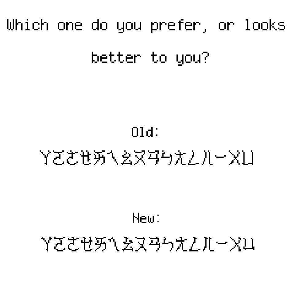


👍
»