image #6 (last one):
image #5:
there are 3 remaining mistakes you still need to fix
image #4 (i call stray bricks as accident bricks):
I like it!
Why is the grid unfinished on the right side of letters?
This font is the fixed Version Bright Lite TMN with alternate S
600 characters
it's my first published font
Added Latin Extended A
@Goatmeal - Thank you! It's been fun trying to find out how to refine them, so I'm glad you enjoy it too.
500 characters
Hello, i am this font's creator alt account. I appreciate your love into this font, some glyphs were hard to make and turned out bad. But feel free to use


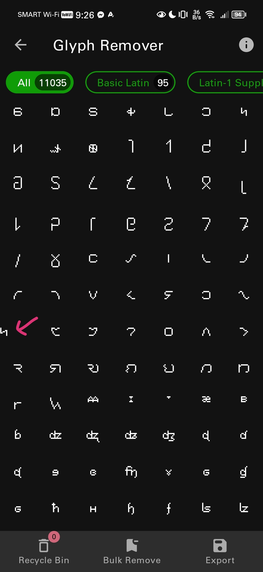


image #6 (last one):