What you do is just make it plain 3d with let's say Illustrator or Project Neo and only after you got the look you want, you ask them to render. Nice font!
2026 09-21: After recently observing another FontStructor's clone of this font, I noticed that the stem of the original 7 made it 1 brick shorter than the other glyphs. It had been corrected.
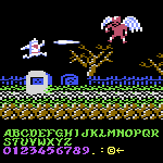
See, @redux, I _have_ been paying attention to your font comments! ;^D Also, High Score input for the win! I used those many times along with memory dumps. :^)
I've added a complete set of Cyrillic small caps. They are important for maintaining typographic consistency and high-end aesthetics in multilingual typesetting.


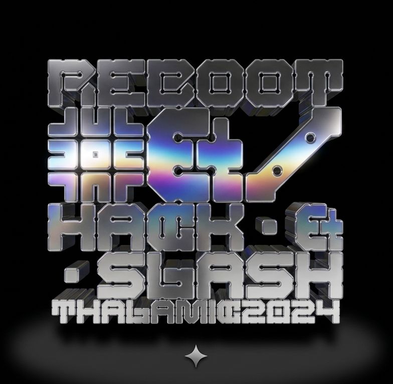






What you do is just make it plain 3d with let's say Illustrator or Project Neo and only after you got the look you want, you ask them to render. Nice font!
»