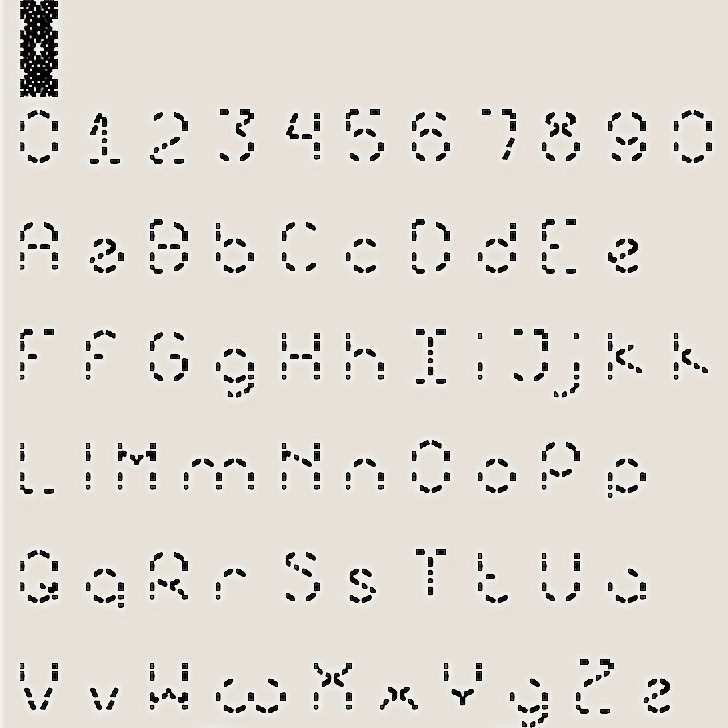
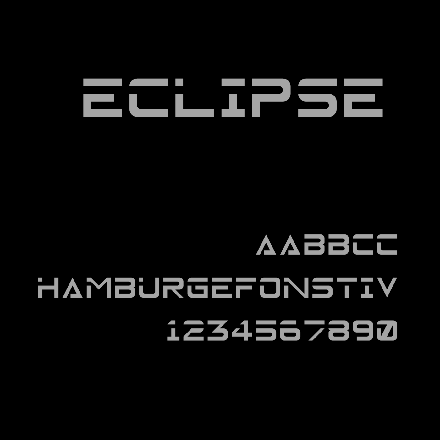
frick i need to update this font
@Bryndan W. Meyerholt (BWM): Indeed, this font corresponds to Bold weight. I have no plans to build a Regular version. It would be extremely difficult to maintain the same letter forms.
maybe do the space double the size
One more thing: the font would benefit from a little more space between words, IMHO.
Congrats on the TP! I love the little hearts over the i and j. Do you plan to complete the font with diacritics and other glyphs?
@CMunk i remember that i once made an alt sigma and put it in there
Latin Extended A plz
@rhwsbbdbwi: Done
@Miguel_Gil i do not know what you're talking about given the fact that the link only works if someone's logged in your account
@Forty-One what are you trying to say with this?
Congrats on the top pick! If there are plans to expand this into a multi-weight font family, this would be probably be the Bold style.
@Rob Meek: Thank you very much for the special mention. Much appreciated.
@elmoyenique: Thank you for your kind words.
I nearly finished the special characters
@meek no way!!! thank you so much!!
elliqvl The cyrillic letter I is like an U!
frick i need to update this font
»