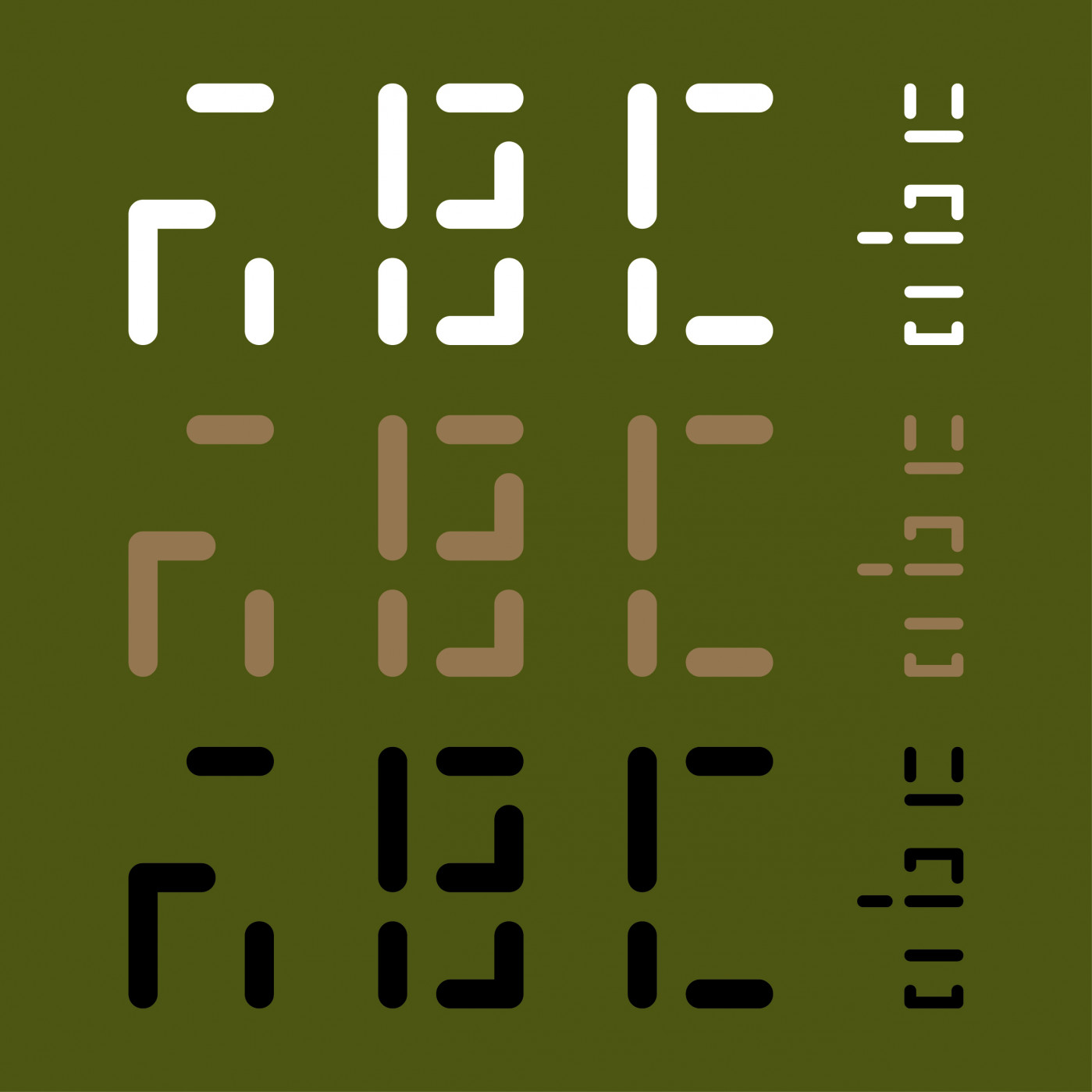
The purpose of this tutorial font is to show all possible brick
combinations that can be used to make a composite, both vertically
and horizontally, plus the 3 squares. There are a maximum of
16 total bricks allowed (plus expmy spaces, see below), but a
composite may contain as few as 2 bricks. Please note that
the square combinations of [2×2], [3×3] and [4×4] are duplicated in
both the vertical and horizontal sets.
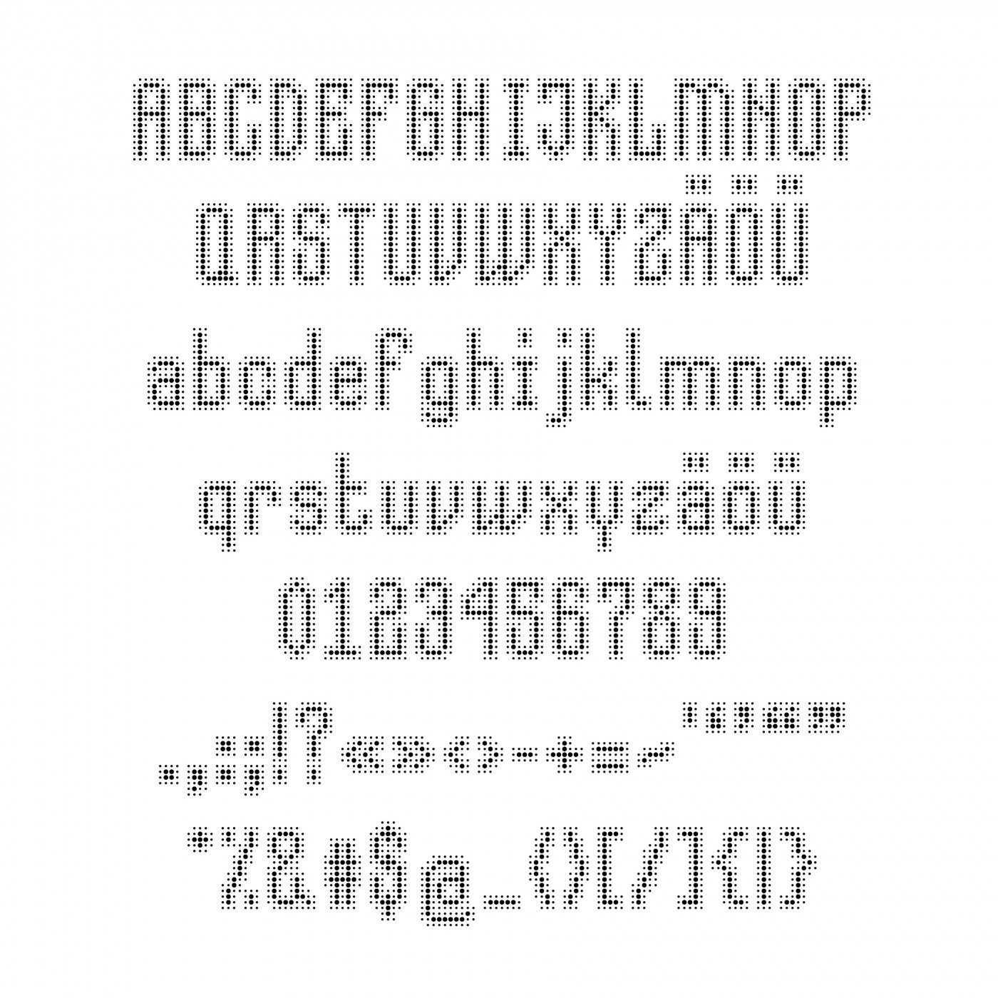
What about making a non-color version? With just differently dense composites to imitate the shades of gray? Hard to judge the real density though, since in browser the countours seem to be bolder than in actual .ttf
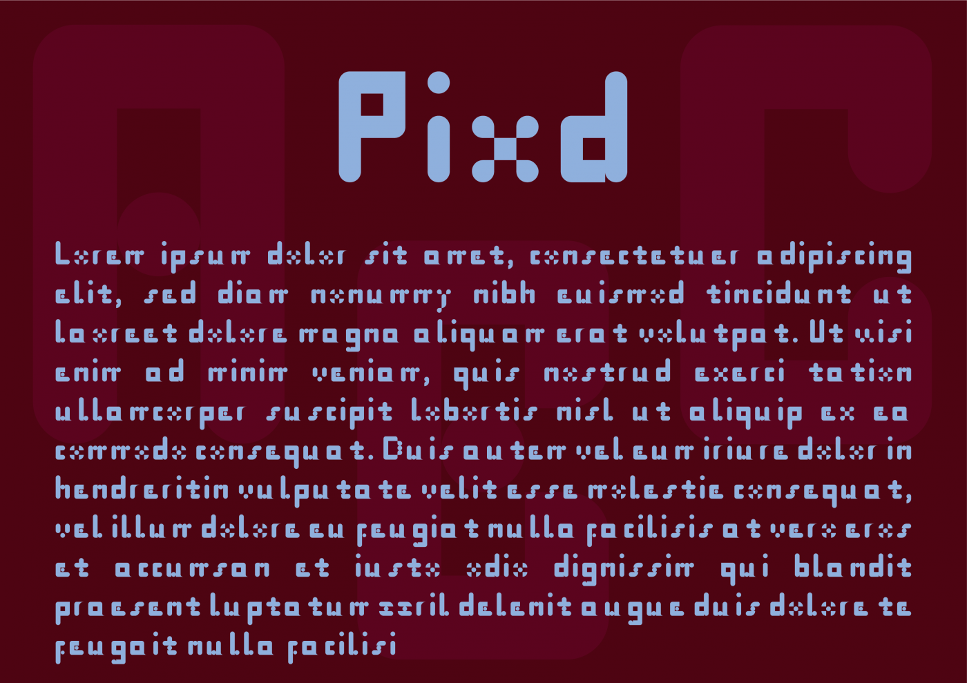
@Igville - Redux is correct; we often comment on the choices made by others when recreating these fonts. And here was my thought on the M/m, but while it is similar to the N/n, my change does look a tad off-balanced... :^(
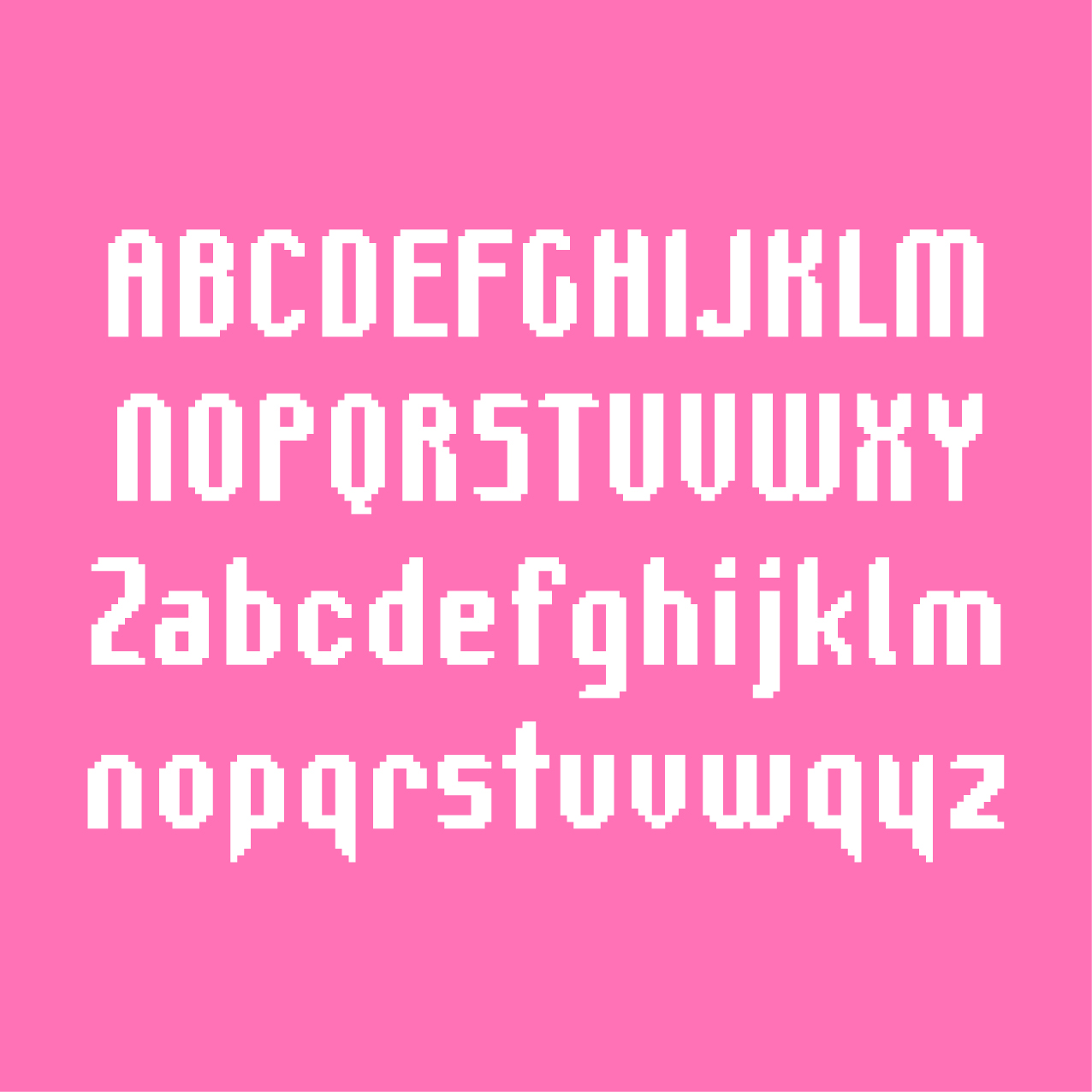
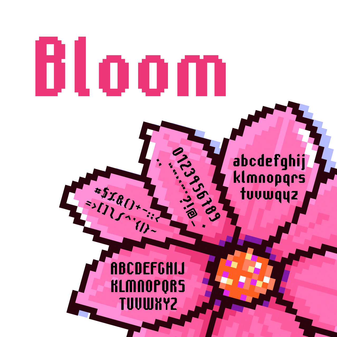
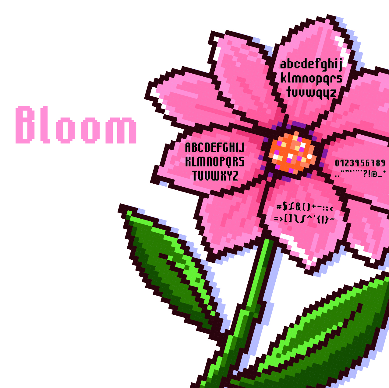
Yeah, I love it; well-balanced. If I had to nit-pick, I'd say I'm not a fan of the '3' or 'y', but every other glyph fits together flawlessly. Nice work.
@Patrick H. Lauke (redux) - Odd choice for the M/m to be 8 pixels wide. It could have been 7 to match the T/t and Y/y, with the right side being only 1 pixel wide like other letters instead of 2 pixels...
I Know This, It's I'ts It's I'ts
»