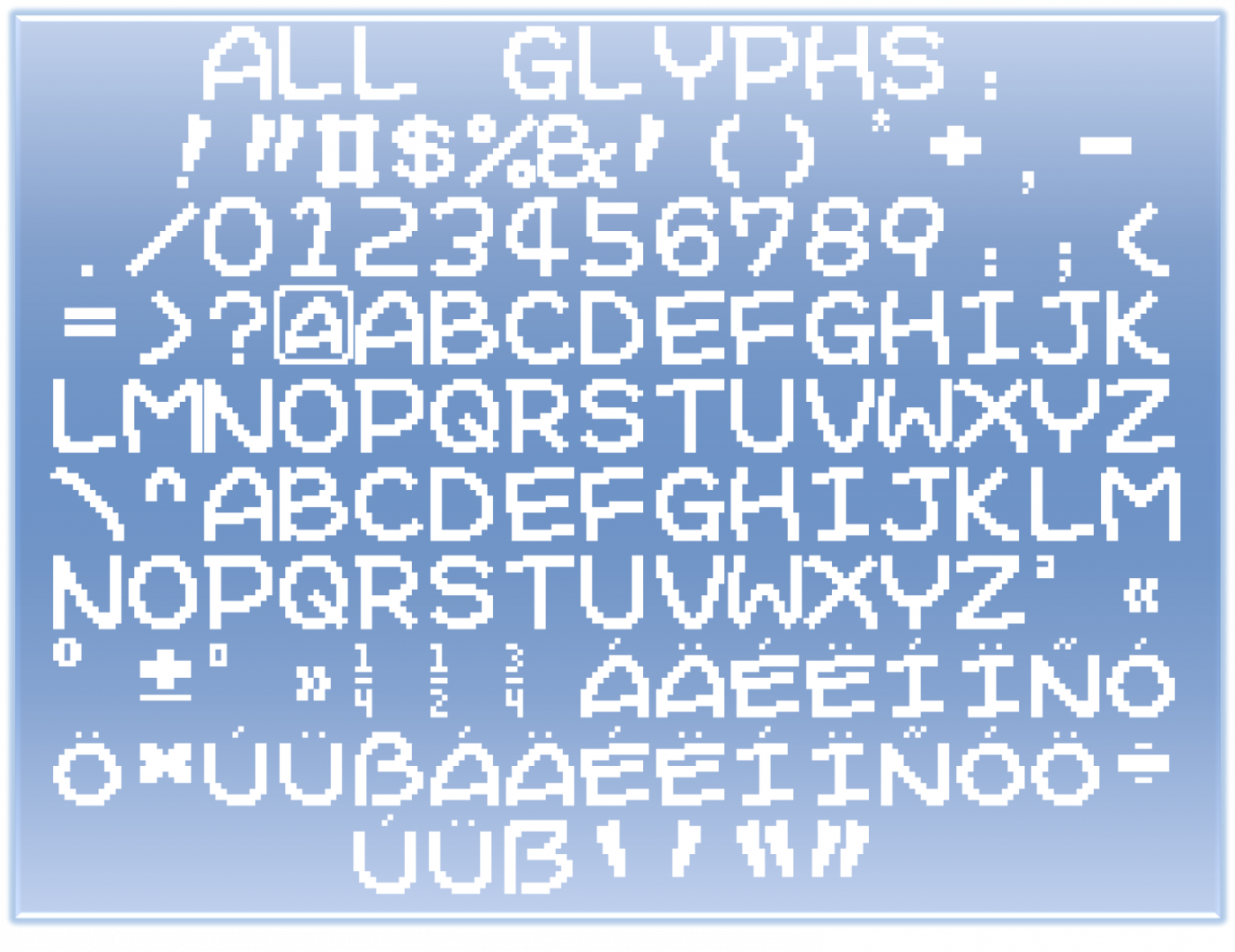
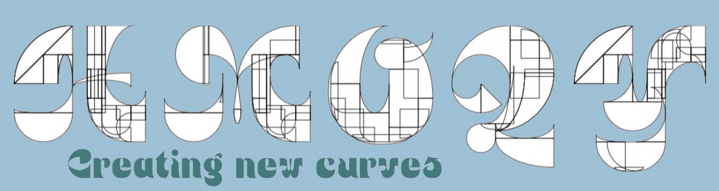
And the internal counters for glyphs like "b"/"d"/"e"/etc. are a bit small, IMHO. Also, the base of the "T" should be "rounded" like other characters ("I" or "F", e.g.). Otherwise, I like these types of fonts. Go for it!
@Mythhand: @Peter (Petruuccio) is right. Here you are more info. Btw, my filter ratio here was 2:2, but it works the same way. Anyway, if you need me to be more specific about any of them, just ask.








tcf=20thh century fox
»