Information:
Yunika Mono font has been renamed to Chelsea Mono font since 30
August 2026, the reason of this rename is to take over the names of
my previous
This is very nice. A hidden gem! It's times like this I wish FontStruct has a user “playlists”/sets/curations of their favourite fonstructions that we can share in our profile pages.
@Patrick H. Lauke (redux) - Another great font, but the 4 is lacking here, too. They SHOULD have made the left vertical as a slight diagonal for a distinct little flair, like on the stem of the 7.
Very nice hand-drawn letters. The text is well-balanced and pleasant to read. It needs kerning here and there. Did you do it with a pen and tablet? 10/10
@Patrick H. Lauke (redux) - My only quibble is with the ‘4’ -- compared to the other glyphs, it looks weak and anemic. They could have taken a few more minutes to design a better version. :^)
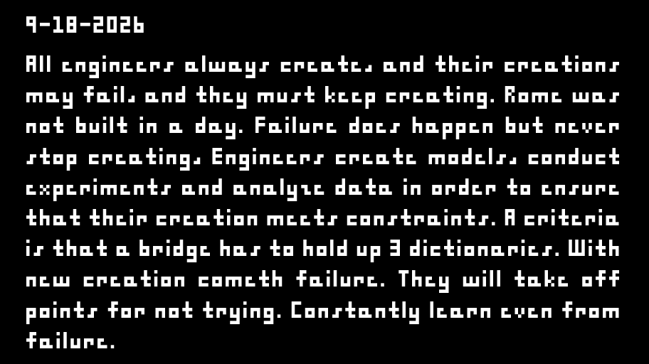
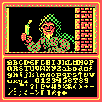
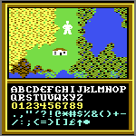
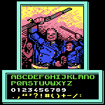
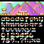
Here is the supplement's character set (as of this writing). I
inserted a full-size capital A and E for comparison. Full set of
alphabetical letters, including
The actual font was only available for Mac computers (albeit older ones) and came on a floppy drive. Though some people have TTFized it, like you can find here: https://compu-lsd.com/archive/fonts
@Catterio: I agree with @Frodo7: even though you may think this font is “nothing special," someone else DID value your efforts -- so take the compliment with humility whenever that work is duly recognized. :^)











@Goatmeal - Thank you. I'm glad you like it, and I appreciate the comments.
That sounds like a neat project, too. I've always loved the little icons games like Final Fantasy and others use.
»