The most worthy letter is the capital letter V, because it represents my FG notation, named Versiontomin.
On the UCAS block, I get a 6~10 day cooldown each syllable row, so expect me adding some glyphs in the International Women's Day.
Update 3.3: Beria Erfe and Greek Extended
Cursive smooth
Weird Letters
PUA added
Bauhaus
Awesome pixelated font.
I like the fluency, but I wonder how it would look if the weight of some letters like B, E, S was shifted form top to bottom. This "top heavy" style
insulting the font will have a risk of account deletion
Wonderful curves. I wonder if there is a way to smoothen out those litlle kinks. Did you work with 2x2 filters?
when unicode 18.0 releases, i am definitely adding jurchen ;)
@NewCurvenBig Are you going to finish Unified Canadian Aboriginal Syllabics?
Arabic isn't completed yet
Smooth
OwO
Eat the glyphs
So Sweet
Eat the s'more letters!
S'more
Yum!
Color
No latin on just color
Small sally
Vötgil Cipher
@NewCurvenBig: A Vötgil symbol refers to one of the 28 characters (consonants and vowels) used in the Vötgil constructed language, created
What is a Vötgil symbol?
@ctcg_ i am, it's just that stuff is getting added near the END of the glyph list ya dimwit. (also, working on a font that makes the fontstructor
hell what the
I like your own Fonts!
I found the Vötgil symbol!
Why You cant Working on too many glyphs work in progess?
I like this Font, I like your Fonts!
I Like this font lot!
looks like dominoes
Nice!
A clean sans serif display with a very effective coloured shadowlayer.
update v1.1 (5·III·26): added thallium and lead
1/9 of the way there!!!





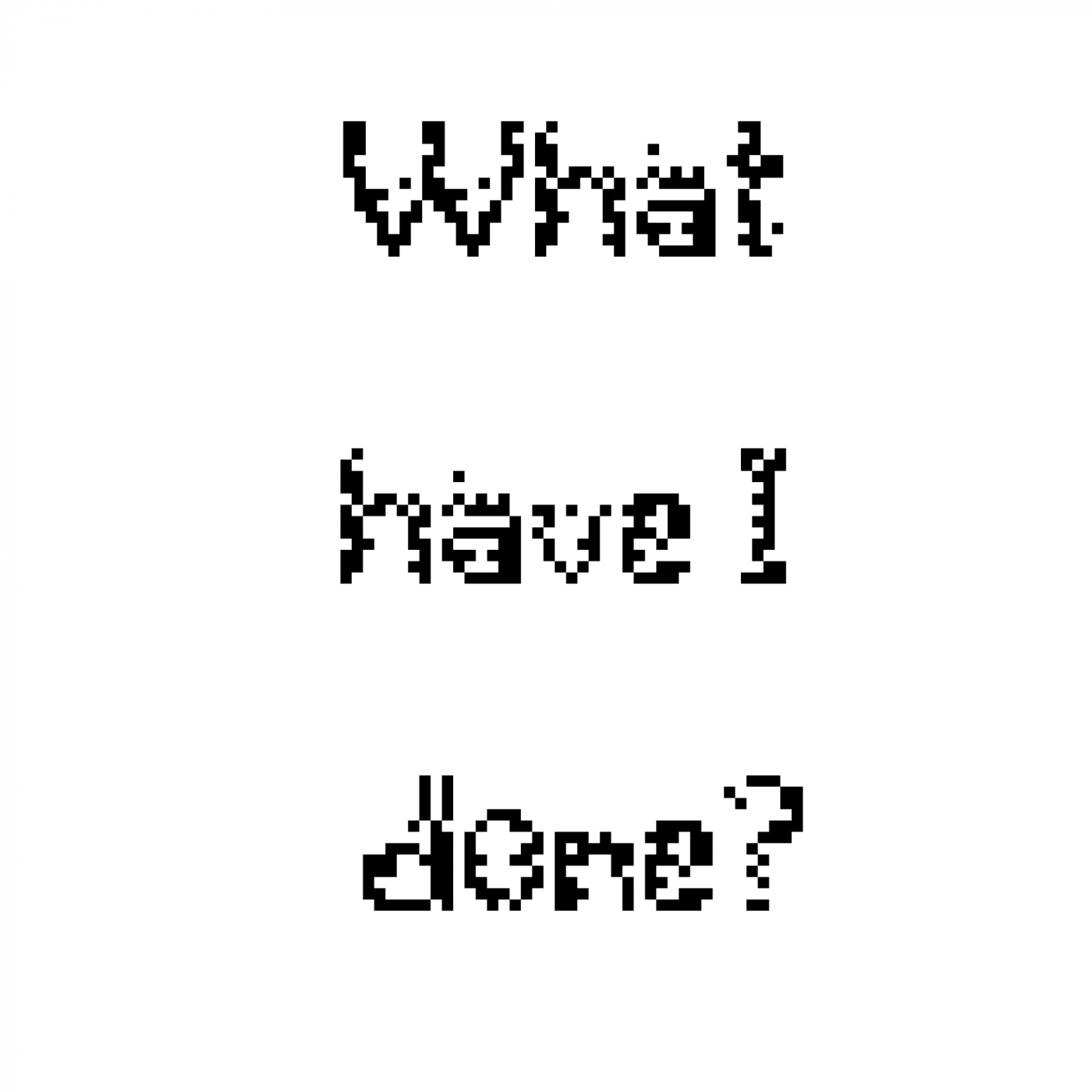
The most worthy letter is the capital letter V, because it represents my FG notation, named Versiontomin.
»