I think im cloning this because i really like this :)
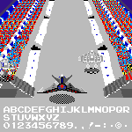
This font was the best font that I've ever made since December 2024...
Very Nice. I like the б and л especially. In the meantime, I've built an alternative M which may suit the Cyrillic set better. It needs
Good news! 4 users voted 10/10!
@Robert Henderson Don't advertise your own work on my (or others) page.
Great!
@Katrina Cigarette: Hi. I like cross-stitch fonts like the one you posted. That's why I humbly suggest you create a variation with a more realistic
A slideshow of some signage glyphs from this font.
Many more are included in the glyph set.
Some progress. Fufaika and Apple.
whoever rated 1/10 in this font, genuinely what is wrong with you?
@Sed4tives: We hope you continue your excellent, meticulous fontstructing work, too.
Thanks...
I still like this font…







I think im cloning this because i really like this :)
»