did fontstruct's comments break or something
@Patrick H. Lauke (redux) - My only quibble is with the ‘4’ -- compared to the other glyphs, it looks weak and anemic. They could have taken a few more minutes to design a better version. :^)
What?
Also, I frogot to finish W…
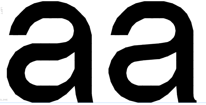
Changed the letters “a” and “s” and their diacritics, to look more like Helvetica: (before: left, after: right)
^what?
T remains the same
@Bryndan W. Meyerholt (BWM): Yes, indeed. Thank you for checking.
For truly, I say to you, until heaven and earth pass away, not an iota, not a dot, will pass from the Law until all is accomplished. Matthew 5:18






did fontstruct's comments break or something
»