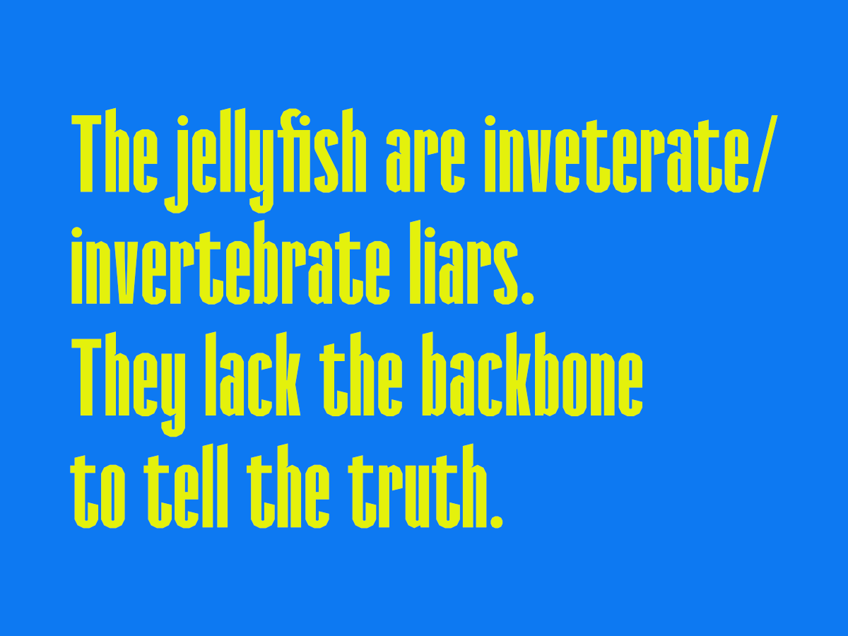
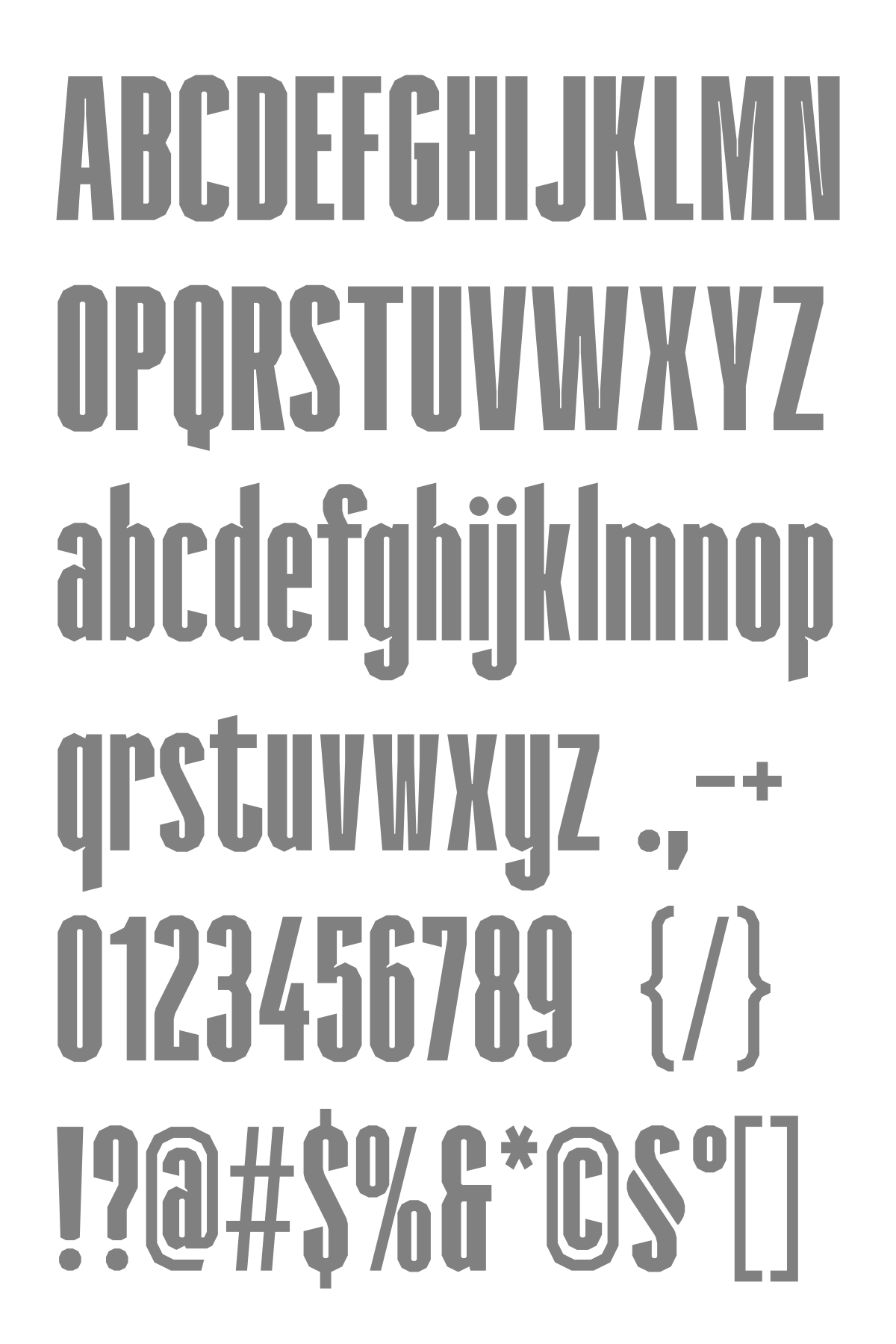
@four: Thank you for your feedback. I studied a few tall and slim fonts, and learned how to manage tight spaces or extreme angles. I'll make a few sample pics later.
@Patrick H. Lauke (redux) - That's an interesting design for the ‘A’. If the ‘R’ wasn't so distinct, that's what I would have thought it might be -- an ‘R’ !






It is based on the Segoe UI or SF Armenian style
»