@NZWStudios2024: I think the spacing is too tight. The leading is disproportional; it looks like double-spaced text on steroids. Why do you need so much empty space between lines?
@beate: Thanks! I'm also interested in your opinion on the diacritic. I want to make it massive, but I'm not sure if it's better to make it separate (like with the letters E Ñ) or combined with the letter, like with the letter A.
So nice, Very constructivist. I would place the dot a little higher and the comma a little lower so that the effect of the slender white line comes through there as well.


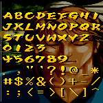




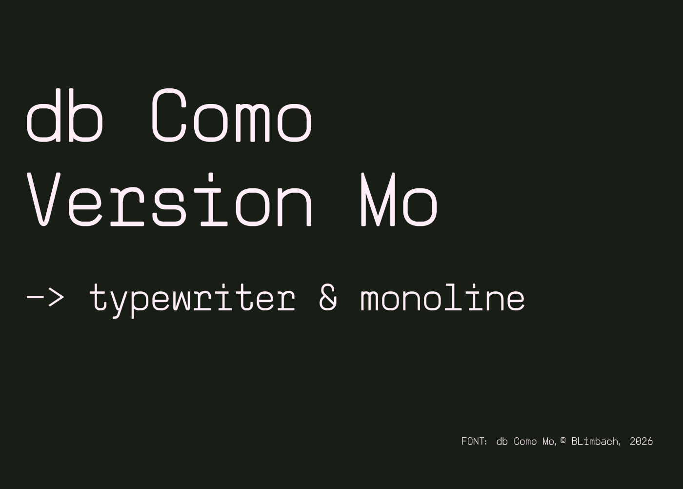

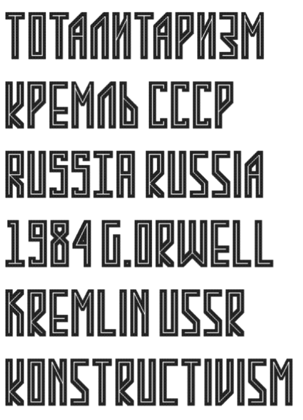


Very nice. 10/10
»