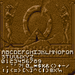
I really like this! It feels like C and G would look more in tune with the rest of the letterforms if they had a sharper upper tip (and in the case of C, maybe a lower tip of the same kind as the one on Q?). I dig the style a lot, good job!
Excuse me, but how did you end up with these quotes, when the only thing that needed to be in purple is highlited with black borders, here in the above sample, and doesn't cover everything?




I'd love to try this tool for myself but the project doesn't seem to exist anymore ;-; Is there a reason why it's no longer up?
Love the unique V and W by the way.
»