A more accurate subtitle would be: ...with added markings (serifs) to help differentiate similar characters, which may be useful for those visually impaired or dyslexic people.
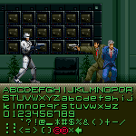
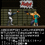
@Patrick H. Lauke (redux) - Excellent. Ocean Software went one step further and made the R B and P look like the logofont. The original 1987 Data East video arcade game didn't even do that!











@doddwell If you increase the spacing, the triangles that you saw are actually vertical rods of different lengths.
»