@Patrick H. Lauke (redux) - Odd choice for the M/m to be 8 pixels wide. It could have been 7 to match the T/t and Y/y, with the right side being only 1 pixel wide like other letters instead of 2 pixels...
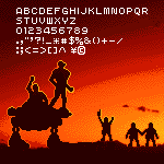
Buttery Speakmeal (Pieza_Bot_2025) - Because Minecraft came out 16 years AFTER this game (2009 versus 1993), it's more accurate to say Minecraft looks like THIS text font. ;^)
Kerning is nearly complete. It is not perfect, but serviceable.
Here are my kerning pairs considered for this particular font:
AV av Av aV
VA va Va vA
AW aw Aw aW
WA wa Wa wA
AT at At aT
TA ta Ta tA
AY ay Ay aY
YA ya Ya yA
FA fa Fa fA
7A 7a A7 a7
LT lt Lt lT
LY ly Ly lY
LV lv Lv lV
LW lw Lw lW
VJ vj Vj vJ
WJ wj Wj wJ
YJ yj Yj yJ
FJ fj Fj fJ
TJ tj
@elmoyenique: Thank you for your kind words. To be brutally
honest, there is not much to celebrate here. This font is merely my
answer to the BigBang typeface (designed
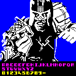
@JeycoMonge - This font is considered complete (as is the
keyboard, which I still use at work, even this afternoon!).
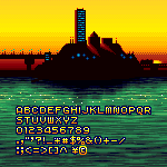
It did what I needed: 5 letters that had media player symbols on
them to control WinAmp's music player. You can see the
greatly-expanded sequel










Ok But Add Tamil Now
»