(or ge with ascender)
where's capital ghe
@Azipose - I agree with @elmoyenique. :^) Aside from the traditional Gothic Blackletter style, was there any other particular inspiration for this pixel font?
can you add unifon? i’m pretty sad because this font doesn’t update frequently unlike before...
It would be very interesting to see how the capital letters and numbers look in this promising project.
@elliqvl: De nada.
@ctcg_: Thanks a lot for your kind words and generous rating!
@meek: Thanks a billion, dear BigChief! Long live FontStruct!!
IMHO, the font can "breathe" a little if their glyphs are slightly separated, as I show you.
stop making badly made unofficial fonts and actually try
\_/"\_/ |--| ""Y""
since when my parents started paying €5 (in £) for it
@NCB you said the uncapitalized pronoun i
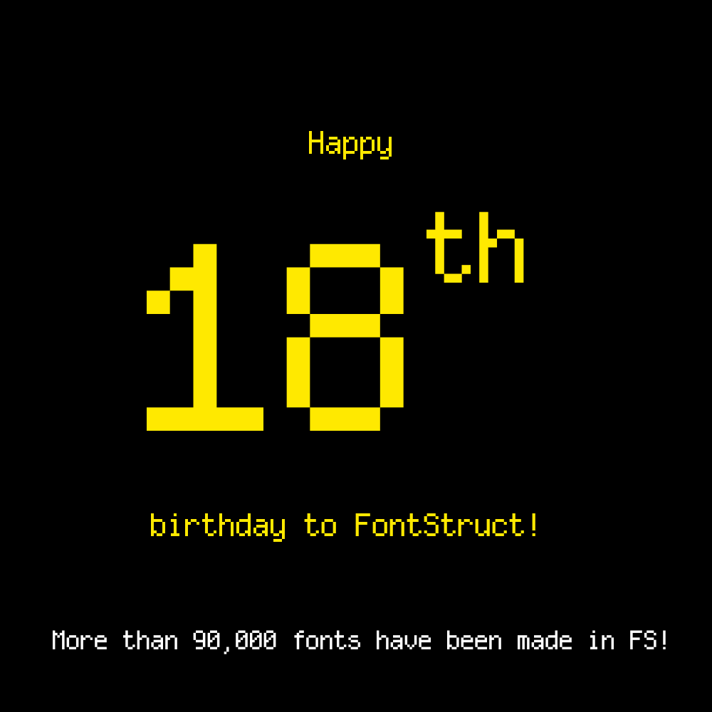
Happy 18th Anniversary, FontStruct!
We have made it so far! FontStruct has retained ease-of-use that will stay continually.
FontStructions in this sample: bloksquare CTCG (top row), pitrix CTCG (number),
Wonderful work!
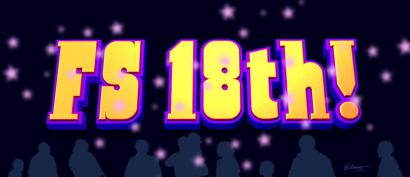
An old idea updated for this event: FS turns 18!... Revisiting an unfinished project is often a good thing. The experience gained over time usually
i didn't say i might get hacked
bro since when were you a patron 😭
weird html hacks
this is not the ultimate unicode font
it has a decent amount of unicode
@Aeolien To enter Google Fonts, a font needs to have at least 2 variants: Regular and Italic. Unforntunately, Fontstruct currently does not support
Well, Houl, remember the Windows XP aliased version of Tahoma? That is a replication for it.
i have
bro put almost 10 ways to write the same equation in the tags
hey @EC-H your font's wrong
updated
@elliq oops (btw it's screechcipher)
no






(or ge with ascender)
»