Congratulations to both, to you Elmo on your new font and to Fontstruct to the anniversary.
Looks Creepy
@lvqille backupukcab ellivql: I made in more latin with additional "OE" and "oe" character
And I decided to make it extended
Thanks for cloning my FontStructions!!!
So glad you revisited this font, it turned out wonderfully, and just in time for Fontstruct's birthday~
I LOVE IT!
What a nice little blocky serif! I wish I was able to congradulate on the day of, but I was to busy with my school quarter ending. (TBHT, this place's anniversery always sneaks up on me.)
anyways,
10/10!
@KT that makes me annoyed
That seems old
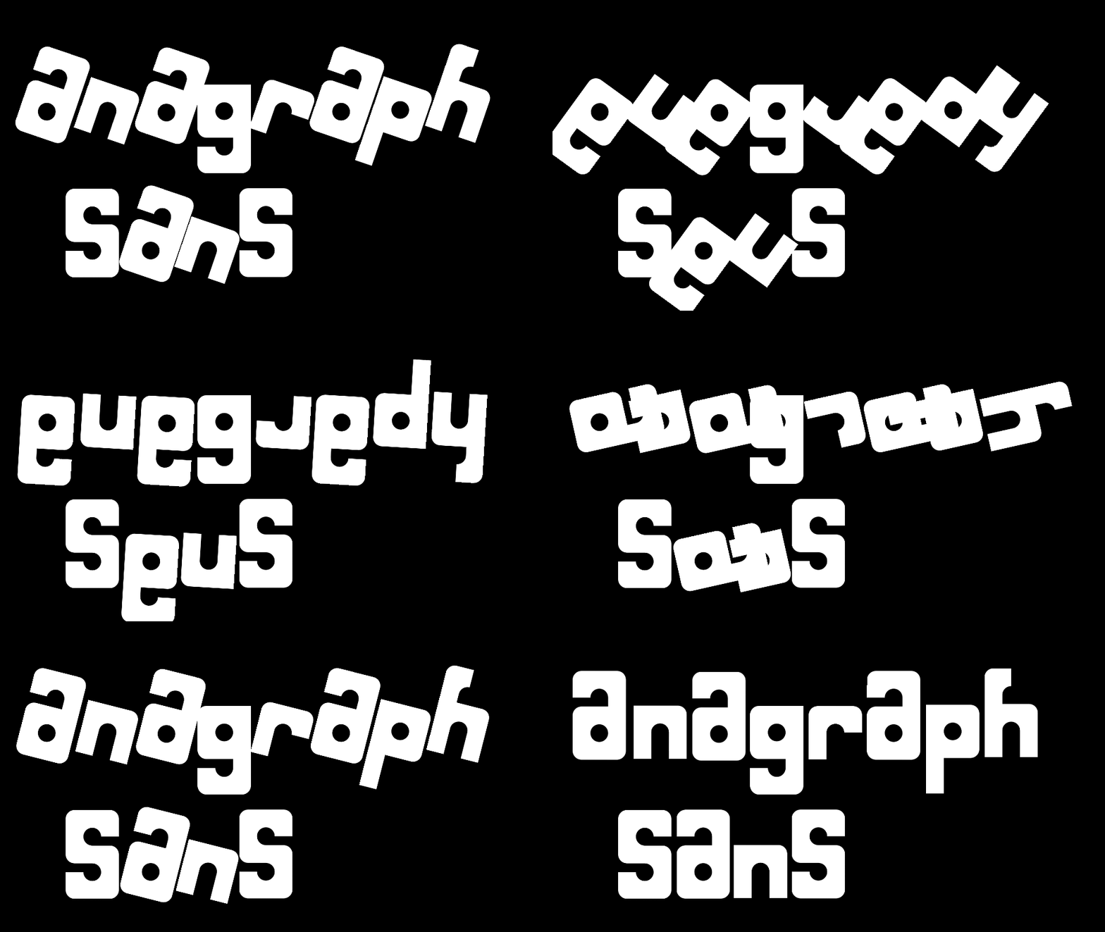
very interesting ambigram font
1.5.4: Added more Cyrillic and finished Cyrillic supplement*
You forgot to add 1.5.4: Finished Cyrillic and the supplement
@Uni611 & @TypoMan F: Thanks.
@Frodo7: Thank you very much for your kind words and I'm glad you like it, Maestro!
Suggestion: Lisu script
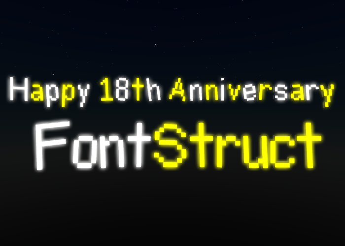
Very nice celebration of FontStruct's 18th birthday. Your font looks pretty, and the demo is professional. Many happy returns of the day! 10/10
?
Hello, Elmo. I like this new fontstruction. I waited for another FS Birthday. I can do a fontstruction for the coming FS birthday (19 Years)?
Unifon is not fully encoded in Unicode.
Development of another font outside FontStruct kind of slowed things down here.
Fs18. ;)









Congratulations to both, to you Elmo on your new font and to Fontstruct to the anniversary.
»