the e is wrong
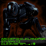
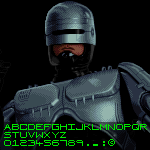
add scanline look, make letters closer together, do both of these else bad font
actually, the scanline look isn't there + make the letters closer together
+ the S is too wide
where's the scanline look of the original logo
the N is the wrong way
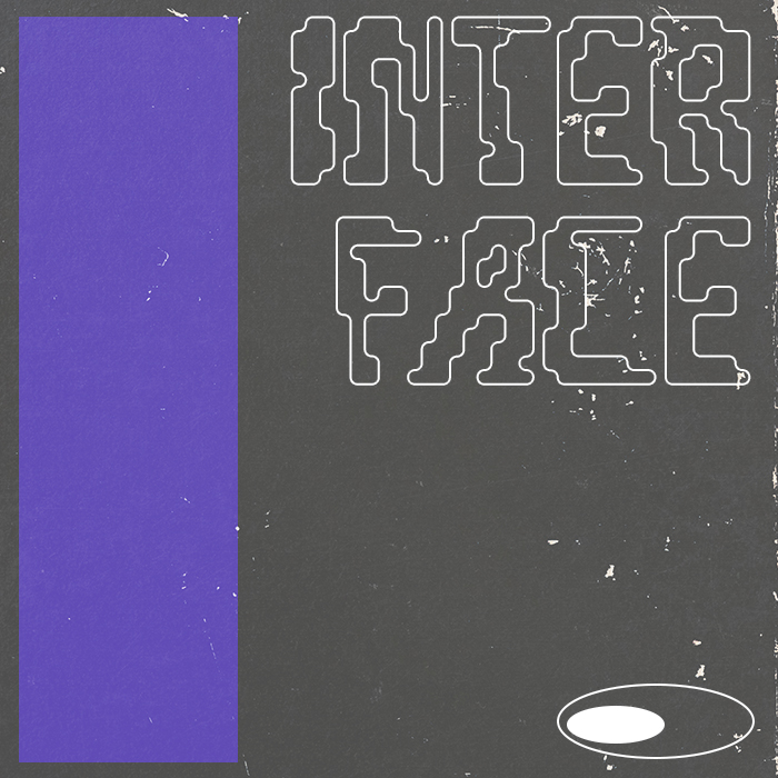
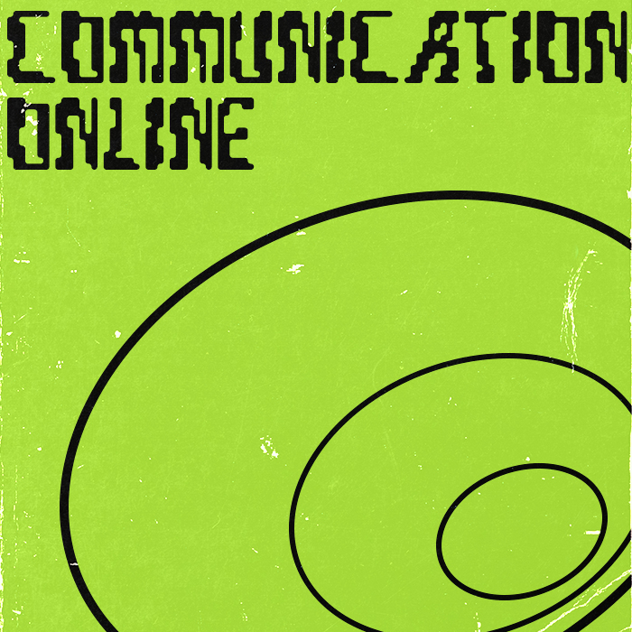
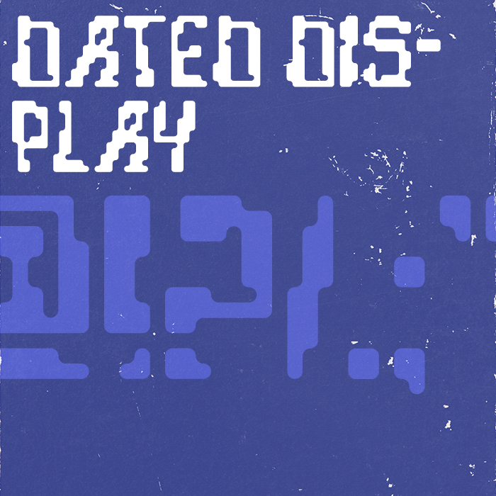
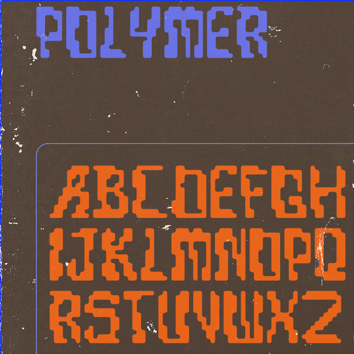
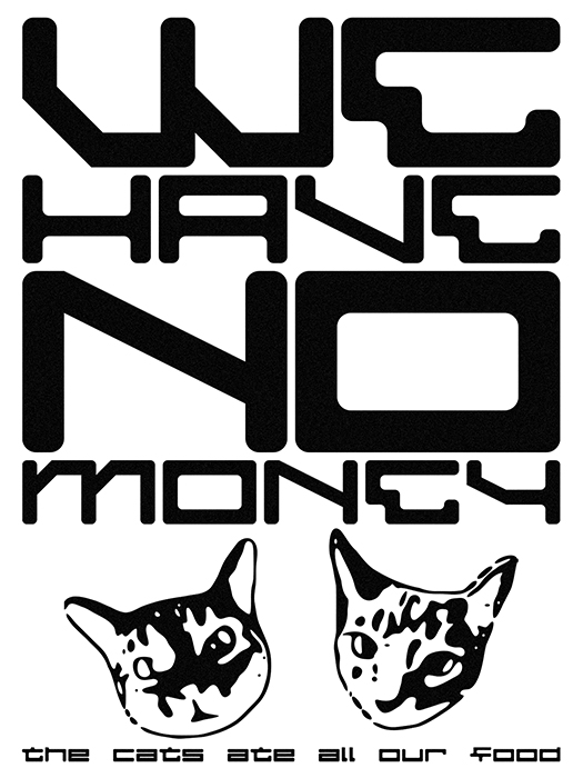
Pixelated retro-futuristic font. All caps, very basic character set, no kerning. Grid-based letterforms with rounded edges are typically designed for arcade games, sci-fi, or
another mistake found! can you fix this? (for clarification, it was supposed to look like an inverted breve, not double grave)
@Gr4ftY & TypoMan Foundry, thanks!
@TypoMan Foundry, stacking & composite bricks did the trick~
つらそうはちひらついおれ is my "Japanified" username in hiragana
Darn! I forgot I deleted that. I have it on an alt, unreleasesed. I might steal some glyphs, tho...
sina pona, tenpo ni la mi kon.
A-B-C-D-E-FU-G-H-I-J-K-L-M-N-O-P-Q-R-STFU-T-U-V-WTF-X-Y-Z I think...
......









the e is wrong
»