

Browse and find FontStructions
Any Category
Creative Common
- Any License
- Commercial Use
- Downloadable
- Cloneable
- All Rights Reserved
- Creative Commons Attribution Non-commercial No Derivatives
- Creative Commons Attribution Non-commercial Share Alike
- Creative Commons Attribution Non-commercial
- Creative Commons Attribution No Derivatives
- Creative Commons Attribution Share Alike
- Creative Commons Attribution
- FontStruct Non-Commercial License
- FontStruct License
- Creative Commons CC0 Public Domain Dedication
- Open Font License
Sort: Sharing Date
Show:
- Staff Picks (369)
- All (4219)
I Love U joined
by hisham44446.77
Click on the stars to rate this FontStruction.
Balanced Rating: 6.77
Average Rating: 6.30
Click for more information about this rating. 10 votes You voted ? for this FontStruction. You may change your vote at any time.
Balanced Rating: 6.77
Average Rating: 6.30
Click for more information about this rating. 10 votes You voted ? for this FontStruction. You may change your vote at any time.

I Love U Black
by hisham44446.58
Click on the stars to rate this FontStruction.
Balanced Rating: 6.58
Average Rating: 5.67
Click for more information about this rating. 6 votes You voted ? for this FontStruction. You may change your vote at any time.
Balanced Rating: 6.58
Average Rating: 5.67
Click for more information about this rating. 6 votes You voted ? for this FontStruction. You may change your vote at any time.
Futoni
by Stelios Constantinides (sconstantinides)6.71
Click on the stars to rate this FontStruction.
Balanced Rating: 6.71
Average Rating: 6.00
Click for more information about this rating. 7 votes You voted ? for this FontStruction. You may change your vote at any time.
Balanced Rating: 6.71
Average Rating: 6.00
Click for more information about this rating. 7 votes You voted ? for this FontStruction. You may change your vote at any time.
Summer Grillz
by afrojet6.88
Click on the stars to rate this FontStruction.
Balanced Rating: 6.88
Average Rating: 6.60
Click for more information about this rating. 15 votes You voted ? for this FontStruction. You may change your vote at any time.
Balanced Rating: 6.88
Average Rating: 6.60
Click for more information about this rating. 15 votes You voted ? for this FontStruction. You may change your vote at any time.
19741084
Published: 24th June, 2008
Last edited: 3rd November, 2008
Created: 24th June, 2008
More gangster than Gill with more gold than Garamond, Summer Grillz is type jewelry for your mouth. All letterforms are diamond-kut using the finest type constructing software on the market today. Customize your grill with different fills. For extra bling and total street-hustle krunk, layer the star fill on top of the base pave set. Color that s#it gold, son. Put your type where your mouth is. Note: kerning subject to da gaps yo teef.
I Love U 2
by hisham44446.17
Click on the stars to rate this FontStruction.
Balanced Rating: 6.17
Average Rating: 5.14
Click for more information about this rating. 7 votes You voted ? for this FontStruction. You may change your vote at any time.
Balanced Rating: 6.17
Average Rating: 5.14
Click for more information about this rating. 7 votes You voted ? for this FontStruction. You may change your vote at any time.
Balder
by typerider6.68
Click on the stars to rate this FontStruction.
Balanced Rating: 6.68
Average Rating: 5.83
Click for more information about this rating. 6 votes You voted ? for this FontStruction. You may change your vote at any time.
Balanced Rating: 6.68
Average Rating: 5.83
Click for more information about this rating. 6 votes You voted ? for this FontStruction. You may change your vote at any time.
Splice
by Stelios Constantinides (sconstantinides)6.52
Click on the stars to rate this FontStruction.
Balanced Rating: 6.52
Average Rating: 5.89
Click for more information about this rating. 9 votes You voted ? for this FontStruction. You may change your vote at any time.
Balanced Rating: 6.52
Average Rating: 5.89
Click for more information about this rating. 9 votes You voted ? for this FontStruction. You may change your vote at any time.
Construct
by Stelios Constantinides (sconstantinides)7.16
Click on the stars to rate this FontStruction.
Balanced Rating: 7.16
Average Rating: 6.92
Click for more information about this rating. 13 votes You voted ? for this FontStruction. You may change your vote at any time.
Balanced Rating: 7.16
Average Rating: 6.92
Click for more information about this rating. 13 votes You voted ? for this FontStruction. You may change your vote at any time.
Light Speed
by deshzx7.06
Click on the stars to rate this FontStruction.
Balanced Rating: 7.06
Average Rating: 6.92
Click for more information about this rating. 26 votes You voted ? for this FontStruction. You may change your vote at any time.
Balanced Rating: 7.06
Average Rating: 6.92
Click for more information about this rating. 26 votes You voted ? for this FontStruction. You may change your vote at any time.
Chromatose Solid
by LexKominek6.24
Click on the stars to rate this FontStruction.
Balanced Rating: 6.24
Average Rating: 5.38
Click for more information about this rating. 8 votes You voted ? for this FontStruction. You may change your vote at any time.
Balanced Rating: 6.24
Average Rating: 5.38
Click for more information about this rating. 8 votes You voted ? for this FontStruction. You may change your vote at any time.
690765
Published: 12th June, 2008
Last edited: 25th February, 2009
Created: 12th June, 2008
A beveled font that has a mid-20th-century vibe to it. Layer the upper and lower cases in different colours. Upper case is highlight, lower case is solid. Numbers are solid, their corresponding punctuation is highlight. Period and comma go with colon and semicolon. UPDATED 25 February 2009: Fixed spacing on X, Y, and 7 so lowercase and uppercase line up.This is a clone of Chromatose
spoty
by galaxy6.06
Click on the stars to rate this FontStruction.
Balanced Rating: 6.06
Average Rating: 5.36
Click for more information about this rating. 11 votes You voted ? for this FontStruction. You may change your vote at any time.
Balanced Rating: 6.06
Average Rating: 5.36
Click for more information about this rating. 11 votes You voted ? for this FontStruction. You may change your vote at any time.
Keyal
by Stelios Constantinides (sconstantinides)7.05
Click on the stars to rate this FontStruction.
Balanced Rating: 7.05
Average Rating: 6.73
Click for more information about this rating. 11 votes You voted ? for this FontStruction. You may change your vote at any time.
Balanced Rating: 7.05
Average Rating: 6.73
Click for more information about this rating. 11 votes You voted ? for this FontStruction. You may change your vote at any time.
Chromatose
by LexKominek7.10
Click on the stars to rate this FontStruction.
Balanced Rating: 7.10
Average Rating: 6.85
Click for more information about this rating. 13 votes You voted ? for this FontStruction. You may change your vote at any time.
Balanced Rating: 7.10
Average Rating: 6.85
Click for more information about this rating. 13 votes You voted ? for this FontStruction. You may change your vote at any time.
1285766
Published: 10th June, 2008
Last edited: 15th June, 2009
Created: 10th June, 2008
A beveled font that has a mid-20th-century vibe to it. Layer the upper and lower cases in different colours. Upper case is highlight, lower case is shadow. Numbers are shadow, their corresponding punctuation is highlight. Period and comma go with colon and semicolon. UPDATED 25 February 2009: Fixed spacing on X, Y, and 7 so lowercase and uppercase line up.
Faceplate Bold
by LadyKilla6.78
Click on the stars to rate this FontStruction.
Balanced Rating: 6.78
Average Rating: 6.00
Click for more information about this rating. 6 votes You voted ? for this FontStruction. You may change your vote at any time.
Balanced Rating: 6.78
Average Rating: 6.00
Click for more information about this rating. 6 votes You voted ? for this FontStruction. You may change your vote at any time.
Origamistic
by deshzx8.52
Click on the stars to rate this FontStruction.
Balanced Rating: 8.52
Average Rating: 8.59
Click for more information about this rating. 39 votes You voted ? for this FontStruction. You may change your vote at any time.
Balanced Rating: 8.52
Average Rating: 8.59
Click for more information about this rating. 39 votes You voted ? for this FontStruction. You may change your vote at any time.
Stackt
by LadyKilla6.93
Click on the stars to rate this FontStruction.
Balanced Rating: 6.93
Average Rating: 6.43
Click for more information about this rating. 8 votes You voted ? for this FontStruction. You may change your vote at any time.
Balanced Rating: 6.93
Average Rating: 6.43
Click for more information about this rating. 8 votes You voted ? for this FontStruction. You may change your vote at any time.
15 Square
by 15shapes6.12
Click on the stars to rate this FontStruction.
Balanced Rating: 6.12
Average Rating: 5.50
Click for more information about this rating. 12 votes You voted ? for this FontStruction. You may change your vote at any time.
Balanced Rating: 6.12
Average Rating: 5.50
Click for more information about this rating. 12 votes You voted ? for this FontStruction. You may change your vote at any time.
no15a
by 15shapes5.99
Click on the stars to rate this FontStruction.
Balanced Rating: 5.99
Average Rating: 5.11
Click for more information about this rating. 9 votes You voted ? for this FontStruction. You may change your vote at any time.
Balanced Rating: 5.99
Average Rating: 5.11
Click for more information about this rating. 9 votes You voted ? for this FontStruction. You may change your vote at any time.
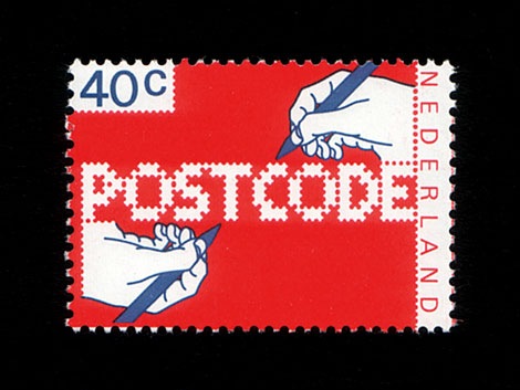
POSTCODE
by nitrada7.55
Click on the stars to rate this FontStruction.
Balanced Rating: 7.55
Average Rating: 7.50
Click for more information about this rating. 26 votes You voted ? for this FontStruction. You may change your vote at any time.
Balanced Rating: 7.55
Average Rating: 7.50
Click for more information about this rating. 26 votes You voted ? for this FontStruction. You may change your vote at any time.
271158713
Published: 6th June, 2008
Last edited: 4th January, 2009
Created: 6th June, 2008
This is still work in progress, a lot of characters missing. There are only UPPERCASE characters available, I filled the lowercase letters with random symbols/patterns. The design is based on this stamp design from 1978 by Gert Dumbar. Use font sizes 64, 128 or 256px. Set leading to 24 (for font size 64), 48 (for 128) and 96 (for 256). More information
BopCloser
by typerider6.77
Click on the stars to rate this FontStruction.
Balanced Rating: 6.77
Average Rating: 6.30
Click for more information about this rating. 10 votes You voted ? for this FontStruction. You may change your vote at any time.
Balanced Rating: 6.77
Average Rating: 6.30
Click for more information about this rating. 10 votes You voted ? for this FontStruction. You may change your vote at any time.
Hectic
by elltee6.51
Click on the stars to rate this FontStruction.
Balanced Rating: 6.51
Average Rating: 6.21
Click for more information about this rating. 19 votes You voted ? for this FontStruction. You may change your vote at any time.
Balanced Rating: 6.51
Average Rating: 6.21
Click for more information about this rating. 19 votes You voted ? for this FontStruction. You may change your vote at any time.
991932
Published: 29th May, 2008
Last edited: 3rd August, 2008
Created: 29th May, 2008
This is a clone of Hectic Outline
Last edited: 3rd August, 2008
Created: 29th May, 2008
This is a clone of Hectic Outline
Blocked In
by nos5.62
Click on the stars to rate this FontStruction.
Balanced Rating: 5.62
Average Rating: 5.15
Click for more information about this rating. 20 votes You voted ? for this FontStruction. You may change your vote at any time.
Balanced Rating: 5.62
Average Rating: 5.15
Click for more information about this rating. 20 votes You voted ? for this FontStruction. You may change your vote at any time.
bop carré
by typerider7.28
Click on the stars to rate this FontStruction.
Balanced Rating: 7.28
Average Rating: 7.00
Click for more information about this rating. 9 votes You voted ? for this FontStruction. You may change your vote at any time.
Balanced Rating: 7.28
Average Rating: 7.00
Click for more information about this rating. 9 votes You voted ? for this FontStruction. You may change your vote at any time.
Project XD
by gmg5106.19
Click on the stars to rate this FontStruction.
Balanced Rating: 6.19
Average Rating: 5.00
Click for more information about this rating. 6 votes You voted ? for this FontStruction. You may change your vote at any time.
Balanced Rating: 6.19
Average Rating: 5.00
Click for more information about this rating. 6 votes You voted ? for this FontStruction. You may change your vote at any time.
Project XR
by gmg5105.99
Click on the stars to rate this FontStruction.
Balanced Rating: 5.99
Average Rating: 5.20
Click for more information about this rating. 10 votes You voted ? for this FontStruction. You may change your vote at any time.
Balanced Rating: 5.99
Average Rating: 5.20
Click for more information about this rating. 10 votes You voted ? for this FontStruction. You may change your vote at any time.
Hectic Outline
by elltee6.85
Click on the stars to rate this FontStruction.
Balanced Rating: 6.85
Average Rating: 6.67
Click for more information about this rating. 24 votes You voted ? for this FontStruction. You may change your vote at any time.
Balanced Rating: 6.85
Average Rating: 6.67
Click for more information about this rating. 24 votes You voted ? for this FontStruction. You may change your vote at any time.
WPA Gothic Deco
by Stephen Coles (Stewf)7.53
Click on the stars to rate this FontStruction.
Balanced Rating: 7.53
Average Rating: 7.49
Click for more information about this rating. 37 votes You voted ? for this FontStruction. You may change your vote at any time.
Balanced Rating: 7.53
Average Rating: 7.49
Click for more information about this rating. 37 votes You voted ? for this FontStruction. You may change your vote at any time.
976312138
Published: 25th May, 2008
Last edited: 23rd June, 2009
Created: 25th May, 2008
Caps from WPA Gothic in a low-waisted "deco" style.This is a clone of WPA Gothic
Last edited: 23rd June, 2009
Created: 25th May, 2008
Caps from WPA Gothic in a low-waisted "deco" style.This is a clone of WPA Gothic
Spaceman
by alexfulton6.10
Click on the stars to rate this FontStruction.
Balanced Rating: 6.10
Average Rating: 5.60
Click for more information about this rating. 15 votes You voted ? for this FontStruction. You may change your vote at any time.
Balanced Rating: 6.10
Average Rating: 5.60
Click for more information about this rating. 15 votes You voted ? for this FontStruction. You may change your vote at any time.
Project M
by gmg5105.56
Click on the stars to rate this FontStruction.
Balanced Rating: 5.56
Average Rating: 4.75
Click for more information about this rating. 12 votes You voted ? for this FontStruction. You may change your vote at any time.
Balanced Rating: 5.56
Average Rating: 4.75
Click for more information about this rating. 12 votes You voted ? for this FontStruction. You may change your vote at any time.
Robot Butler Solid
by LexKominek6.39
Click on the stars to rate this FontStruction.
Balanced Rating: 6.39
Average Rating: 5.82
Click for more information about this rating. 11 votes You voted ? for this FontStruction. You may change your vote at any time.
Balanced Rating: 6.39
Average Rating: 5.82
Click for more information about this rating. 11 votes You voted ? for this FontStruction. You may change your vote at any time.
340753
Published: 24th May, 2008
Last edited: 10th July, 2008
Created: 24th May, 2008
The bottom layer of the Robot Butler series.This is a clone of Robot Butler Open
Last edited: 10th July, 2008
Created: 24th May, 2008
The bottom layer of the Robot Butler series.This is a clone of Robot Butler Open
Robot Butler Open
by LexKominek6.67
Click on the stars to rate this FontStruction.
Balanced Rating: 6.67
Average Rating: 6.25
Click for more information about this rating. 12 votes You voted ? for this FontStruction. You may change your vote at any time.
Balanced Rating: 6.67
Average Rating: 6.25
Click for more information about this rating. 12 votes You voted ? for this FontStruction. You may change your vote at any time.
rooftiler
by typerider6.48
Click on the stars to rate this FontStruction.
Balanced Rating: 6.48
Average Rating: 5.50
Click for more information about this rating. 6 votes You voted ? for this FontStruction. You may change your vote at any time.
Balanced Rating: 6.48
Average Rating: 5.50
Click for more information about this rating. 6 votes You voted ? for this FontStruction. You may change your vote at any time.
1931152
Published: 23rd May, 2008
Last edited: 20th August, 2020
Created: 23rd May, 2008
Jotted down the roots of this months ago in a squared moleskine... Viva Fontstruct! This is heaven-sent. Compared it to 'Stitches' in the gallery and not to my surprise some characters are identical. But the word-images are more open and there's lowercase included. Narrowing the playground and keeping it fun was the challenge. Reactions are welcome.